This page is highly technical, statistical, and primarily intended for documentation purposes. If you are not a statistician, you can skip this whole page and miss nothing. For those statistically inclined, this page might hold some interest just to find out the various kinds of distributions that music contains. For the untrained curious, we err on the side of over-explaining the statistical results.
This page walks through most, but not all, of the metrics defined in Music Metrics and describes how each of them is distributed within the Skiptune database. If you are new to statistics, you might have the preconception that everything in the world has a bell curve distribution. In fact, many things you run across in every day life have normal distributions. But in music, it turns out that a normal distribution is uncommon.
We recognize that testing for normality (a bell-shaped distribution) in a very large sample is controversial among statisticians. We don’t use these results in any way in our analysis, and the distributions are presented here merely for those interested in the shape of those distributions.
Here is a summary table of the results of testing for a normal distribution for each music metric:
Table 1–Normality Test for Distributions of the Music Metrics
| Metric | Results of D’Agostino-Pearson Test for Normality (K,p) | Normally Distributed | |
|---|---|---|---|
| 1 | # of Patterns in Tune | 2927; 0 | No |
| 2 | % of Patterns in Tune | 294; 0 | No |
| 3 | # of Single-occrrence Patterns | 2646; 0 | No |
| 4 | Single-occurrence Patterns as % of Tune Patterns | 12; 0.003 | Roughly |
| 5 | Single-occurrence Patterns As % of Notes | 2009; 0 | No |
| 6 | Rests Per Note | 4533; 0 | No |
| 7 | Absolute Pitch Change | 4885; 0 | No |
| 8 | Relative Pitch Change | 2923; 0 | No |
| 9 | Use of Common Patterns (%) | 145; 0 | No |
| 10 | # Unique Patterns/# of Unique Patterns As % of Tunes | 11,431; 0 | No |
| 11 | % of Tunes with Unique Patterns | 5842; 0 | No |
| 12 | Range of Pitches | 2316; 0 | No |
| 13 | Note Duration Ratio | 5945; 0 | No |
| 14 | Runs Per Note | 281, 0 | No |
| 15 | Average Run Length | 2011; 0 | No |
| 16 | Max Run Length | 5523; 0 | No |
| 17 | Repetitive Note Durations | 192; 0 | No |
| 18 | Repetitive Note Pitches | 2154; 0 | No |
| 19 | Spread of Two-Note Pattern Frequences (Weighted) | 2822; 0 | No |
| 20 | Spread of Two-Note Pattern Frequences (Unweighted) | 1597; 9 | No |
| 21 | Pick-up Duration | 3498; 0 | No |
| 22 | Pick-up % | 6760; 0 | No |
| 23 | Going to Rests | 3664; 0 | No |
| 24 | Coming from Rests | 1952; 0 | No |
| 25 | # of Different Pitches | 3039; 0 | No |
| 26 | # of Different Pitch Differentials | 2794; 0 | No |
| 27 | # of Different Durations | 2304; 0 | No |
| 28 | # of Different Duration Ratios | 3733; 0 | No |
| 29 | Normalized # of Different Pitches | 2951; 0 | No |
| 30 | Normalized Number of Pitch Differentials | 1665; 0 | No |
| 31 | Normalized # of Durations | 2693; 0 | No |
| 32 | Nomralized # of Duration Ratios | 2142; 0 | No |
| 33 | % Tunes with Same Patterns | 172; 0 | No |
In summary, Table 1 tells us that not a single metric is distributed normally, though “Single-Occurrence Patterns as % of Tune Patterns” is clearly approximately normal. While not universal, most of the music metrics are skewed right, often because the metric doesn’t allow for a negative number or is otherwise crunched on the left.
The rest of this page consists of a walkthrough of each music metric in the same order as in the example and the page on metric statistical tests. We briefly discuss the histogram and cumulative distribution frequency plot for each music metric.
1. Number of Patterns in Tunes
Here is the histogram of the number of different two-note patterns in each tunes for the entire Skiptune database:
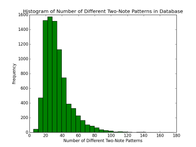
From a statistical point of view, the most important insight from this histogram is that the distribution isn’t perfectly normal and instead is skewed right. One wonders what the extremes are. The smallest number of patterns that make up a tune in the database is five and there are two tunes with five patterns: The “Danish Amen” written at the end of the 19th century and the “Dresden Amen” (also known as the “Twofold Amen”) written toward the end of the 18th century. Both of these tunes may be familiar to most people. The tune with the largest pattern is not as well known: “Legend” from the operetta Babes in Toyland written by Victor Herbert. “Legend” has a remarkable 177 set of different two-note patterns. “Legend” changes key twice and changes the time signature six times. Although it is a longer tune than average (almost two pages of melody when written in standard notation), it is nowhere near the longest. Herbert simply used lots of different interval jumps, varied his durations greatly, and sprinkled in non-consecutive triplets.
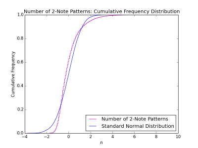
A better “eye test” of data normality is the cumulative frequency distribution (CDF) plot. Figure 2 shows the CDF plot for the first metric, the number of two-note patterns in the tunes. The figure tells us that the metric has more two-note patterns that are small in number when compared to a normal distribution, more that are average than in the normal distribution, and fewer that are high in number when compared to those in a normal distribution.
Finally, we note that the results of applying the D’Agostino-Pearson normality test to this metric results in rejection of the null hypothesis that the metric is drawn from a normal population. (We shall generally refer to the D’Agostino-Pearson test as the “normality test.”) This test result (see Table 1) confirms what our eyes tell us: The number of two-note patterns in each tune is not normally distributed in the database.
2. Percent of Patterns in Tune
When expressed as a percent of the total number of notes in a tune, the number of two-note patterns appears to be more normally distributed than the previous metric. The following figures illustrate that finding:
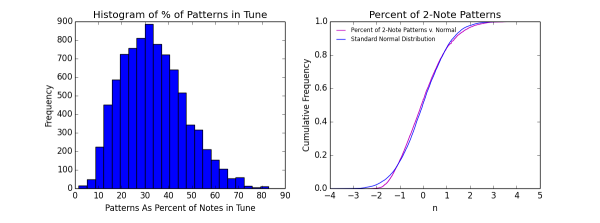
The histogram on the left clearly indicates skewing toward the right, whereas the Cumulative Distribution Frequency (CDF) plot indicates a good normality fit. The CDF figure does indicate that there are more tunes with a lower percentage of two-note patterns than in a normal distribution, and slightly more with a higher percentage, but the fit in the middle is quite good. However, the ‘Agostino-Pearson normality test makes it quite clear that we can reject the null hypothesis that this music metric is from a normal distribution, and it does so with quite a wide margin, even at the 99 percent confidence level. This metric is a good example of using a combination of eye and numerical tests to determine normality. Relying on the CDF plot alone, we might have thought this metric is close enough to being normally distributed. The histogram might throw some caution into our decision as it exhibits clear skewness. But the numerical test is unambiguous in rejecting normality.
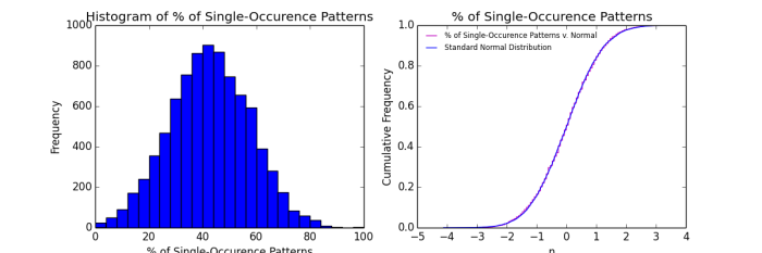
3. Number of Single-Occurence Patterns
The distribution of the number of two-note patterns that occur exactly once in a tune is heavily skewed to the right as the following histogram and CDF plot show:
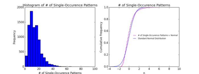
The CDF plot tells us that there are quite a few more one-time patterns–both in tunes where there are just a few such patterns and in tunes where there are a lot of such patterns–than a normal distribution would suggest. For the average tune, there are fewer one-time patterns than in a normally distribution. The formal normality test yields results (see Table 1) that confirm what our eyes tell us: this metric is far from normal.
4. Single-Occurrence Patterns As Percent of Different Patterns in Tune
When the number of stand-alone two-note patterns (“single-occurrence”) is expressed as a percent of the number of different two-note patterns in a tune, the resulting distribution looks normal (see Figure 5):
Looking at the histogram in Figure 5, note that the left tail is slightly truncated by the “zero” limit (one can’t have a negative occurrence of a pattern), whereas the right-hand tail extends further. But one can also see an asymmetric pair of bars around the 600-tick mark on the y-axis. A close inspection of the CDF plot reveals corresponding slight bumps in the middle section of the curve which we might have missed were it not for the clues provided by the histogram. The formal normality test confirms that the percent of single-occurrence patterns is not normal with a probability of over 99 percent that the null hypothesis of normality should be rejected. But such deviations are in themselves interesting and will bear investigation at a later date.
5. Single-Occurrence Patterns As Percent of Number of Notes in Tune
Calculating the same raw count, the number of two-note patterns that occur one time in a tune, and dividing by the number of notes in the tune produces a completely different distribution compared to the previous metric:
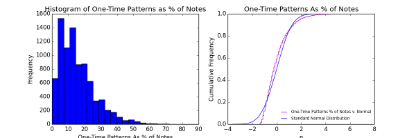
This distribution is no where near normal. The distribution is heavily skewed toward the right, which means that melodies generally have few one-time patterns relative to the number of notes. The CDF plot bears this finding out. There is a relatively large gap between the two curves at the bottom where the low-pecentages are distributed, telling us that there are a lot more tunes with lower percentages of one-time patterns than a normal distribution would have. There are also more at the higher percentage levels (see the top of the CDF plot), but the difference is smaller. In the middle of the curve, there are fewer occurrences of one-time patterns than a normal distribution would suggest. One might wonder why this distribution is so different from the previous metric, which is almost normal. This metric was normalized using the number of notes in each tune, which can be quite large. In contrast, the previous metric was normalized using the number of different two-note patterns, which is always smaller than the number of notes. A smaller denominator for the previous metric means a larger percentage, so the fact that one cannot have a negative percentage does not truncate the distribution at zero.
6. Number of Rests As Percent of Notes
When expressed as a percent of the number of notes in a tune, the number of rests in that tune is heavily skewed to the right as shown in Figure 7:
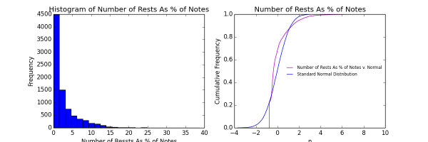
Most tunes have very few rests relative to the number of notes (otherwise the tune would be largely silent!), so the distribution of the number of rests as a percent of notes is bunched toward zero. This distribution awaits further analysis, but it could be Pareto, Gamma, a Chi-squared distribution, or a number of other distribution types. This music metric’s usefulness in distinguishing tunes is doubtful, but we include it here for completeness.
7. Absolute Pitch Change Average
The metric measuring the average absolute change in pitch (including rests) is also bunched toward the zero end of the x-axes:
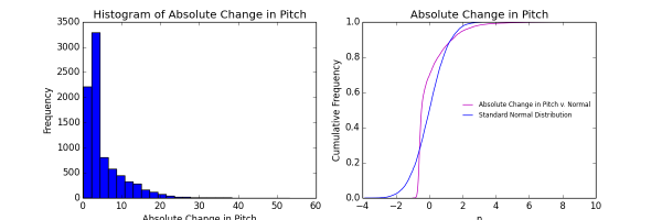
While similar to the previous distribution, the peak suggests a lognormal, gamma, or weibull distribution. These figures suggest that most tunes have fairly small changes in pitch from note to note. The mode (tallest bar) is around 2.5 to 4.5 MIDI values in change, but the second largest bar is that for less than 2.5 MIDI values in change. The CDF plot confirms our normality test finding that the distribution is not normal. As an aside, note the right-hand tail of the histogram and see that a small number of tunes have average pitch changes above 40. Given that rests are only valued at 42, how can this be? The answer is that some tunes have series of discontinuous rests. Every time a not drops to a rest or follows a rest, the value of this metric is the absolute MIDI value of that note, which averages in the 70s. For example, consider the “Blue Danube” by Strauss:

The MIDI values for most of those notes are in the 80s, and each movement to a rest and from a rest results in an 80+ data point. So lots of rests push up the value of this metric. In one sense the skewness of this distribution is a mathematical result of the way we’ve defined this particular metric. The jury’s still out as to whether it’s a valuable metric.
8. Relative Change in Pitch
When the effects of rests are excluded, the distribution of pitch changes approaches (but doesn’t reach) normality. Aside from the change in shape, notice that in Figure 9 the horizontal scale is much smaller. No tune has an average pitch change greater than eight., which is unsurprising when one realizes that melodies would sound too jumpy if the notes bounced too far f rom one another.
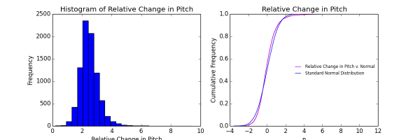
While the histogram appears near normal, the CDF plot reveals that there are more tunes with small pitch changes than in a normal distribution, and fewer with large pitch changes than in a normal distribution. The normality test yields a vanishingly small probability that this distribution is normal.
9. Use of Common Patterns (%)
The histogram of how often composers use common patterns in their tunes is close to normal, but it’s easy to see a slight asymmetry in the figure. The bulkiness on the left side of the histogram indicates there are more tunes with fewer common patterns than there are tunes with more common patterns.
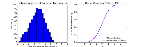
The CDF plot confirms that there are more tunes with fewer common patterns in a normally distributed tune database (note the separation of the magenta and blue lines at the bottom of the curve). Although the two curves track each other closely, they do cross each other several times, indicating a distortion in the normality. The formal normality test confirms the distortion and rejects the normal hypothesis at a high probability level.
10. Number of Unique Two-Note Patterns as Percent
We would expect that most tunes would have no unique two-note patterns, and in fact the distribution is sparsely populated with such tunes, as shown in this figure:
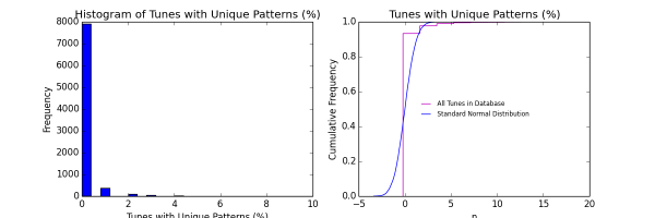
With only one out of ten tunes containing at least one unique pattern (one that occurs in no other tune), the distribution is highly concentrated at the zero mark in the histogram. With so little variation in this metric, it is likely to be of limited use in explaining melodic differences. But examining how unique patterns are used within tunes, and when in history composers break from their ruts and create a new one, are both worth exploring. The CDF plot shows how discontinuous and concentrated this metric is.
11. Frequency of Tunes with Unique Two-Note Patterns
This metric differs from the previous metric in that it counts the number of tunes that have at least one unique two-note pattern. That makes this a bimodal distribution as seen from the histogram:
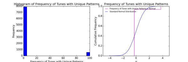
Being bimodal, this metric shows too little variability to explain much, although it does have some usefulness in distinguishing musical genres like baroque and folk or rock and jazz. We wouldn’t expect the CDF plot to indicate normality or the normality test itself, and they don’t. Roughly one out of ten tunes has a unique pattern in it, but this ratio will drop as we add more and more tunes. The number of possible two-note patterns is finite and as we add songs we will likely start duplicating at least some patterns that are now unique.
12. Range of Pitches
The distribution of the range of pitches in the tunes has an unusual shape relative to the other metric distributions. As is often he case, the distribution is skewed right, but there’s an unusual preponderance of tunes with less-than-average that is not reflected in tunes with above-average pitch ranges in a symmetrical fashion. Those tunes with large pitch ranges, rather than being clumped as they are for tunes with smallish pitch ranges, are spread out over a far larger range. You can see this by comparing the left hand side of the histogram with the right.
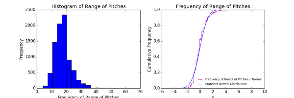
The CDF plot looks as expected from the histogram with the database tunes differing from a normal distribution all along the axis. The normality test confirms the lack of a standard normal distribution.
13. Frequency of Duration Ratios
The nature of this metric, which uses duration ratios, means that we’re working with averages of data that range from just above zero to high double digits, with a goodly number between 0 and 1. By definition, duration ratios are between 0 and 1 when the first note is longer in duration than the note following it. Likewise, duration ratios are greater than 1, with no upper limit, when the first note is shorter in duration than the one that follows it. This metric is a series of data consisting of the average of duration ratios for each tune heavily grouped toward the value of “one.”

The histogram makes it clear that the data tail off quickly with higher duration ratios, probably limiting the usefulness of this metric for explanatory purposes. The CDF plot confirms the absence of normality as does the normality test.
14. Number of Runs Per Note
Another near-normal distribution, the histogram of number of runs per note exhibits some asymmetry on the left side of the mode, but otherwise appears to be balanced:
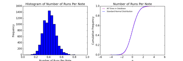
However, the CDF plot shows that in comparison with a normal distribution, the tunes in the database have fewer runs per note in tunes where runs are scarce and where runs are common (see the very bottom an very top of the CDF plot). The middle part of the CDF plot shows a close hewing to the normal distribution curve, but note the little steps in the magenta curve. They mostly jut to the left, indicating more runs per note than one would expect in a normal distribution. The normality test confirms that absence of strict normality for this metric.
15. Average Run Length
The distribution of the average number of notes in a run is clearly not normal though it is somewhat bell-shaped. The histogram shows that the distribution of average run length sits close to the origin, which truncates the left tail.
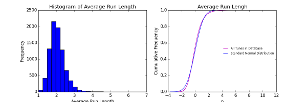
The CDF plot makes clear that there are fewer tunes with short run lengths than would be expected in a normal distribution, more in the upper middle section than would be expected, and again fewer in the upper section (the right-hand tail of the histogram). In other words, this distribution is “peakier” than a standard normal distribution.
16. Average Maximum Run Length
The distribution of the average longest run in the tunes shown here:
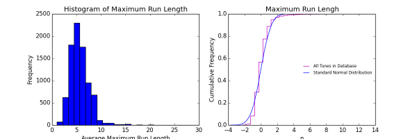
Again, the origin truncates the left tail, causing the distribution to be skewed right. The CDF shows an unusual stair-stepping when compared to the standard normal distribution, even though we are averaging the maximum run lengths so they are continuous. This stair-stepping is the result of having a high concentration of maximum run lengths in the lower part of the range of possible maximum run lengths, while at the same time having a long tail. Almost 90 percent of the average maximum run lengths are under 8 notes, and yet the tail stretches on to around 27 notes. The tail is very sparsely populated, and that makes the distribution appear discrete. The normality test confirms the non-normal nature of this distribution.
17. Repetitive Note Durations
The distribution of the number of times a note duration is repeated appears truncated and a bit squat, but it exhibits some features of normality:
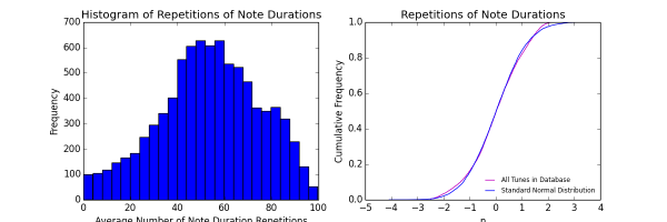
Although the histogram exhibits truncated tales and asymmetry, the CDF plot shows that the distribution, while clearly non-normal, matches up pretty well in the middle portion of the frequencies. But at both the low and high ends of the range there are more note durations repeated than in the standard normal distribution. The normality test confirms with high confidence that this distribution is not normal, but it is closer than many others are to being normal.
18. Repetitions of Pitches
The distribution of how many times pitches repeat as a percent of the number of notes is skewed to the right as shown in the following histogram. Keep in mind that this metric counts a pitch repetition regardless of the note duration.
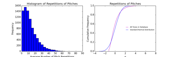
This distribution is consistent with the observation that most tunes don’t rely on repeating notes too much because doing so would make for a repetitive and boring melody. The histogram reveals a relatively smooth distribution whose characteristics we will explore some other time. The CDF plot shows that there are many more tunes with a low number of repetitive pitches than in a normal distribution, fewer around the middle, and more again with a high number of repetitive pitches. The normality test confirms little evidence for normality.
19. Spread (Standard Deviation) of Two-Note Pattern Frequencies (Weighted Occurrences)
This metric captures the spread of the distribution of how often two-note patterns, weighted by repeated patterns, occur in the database. A low value for this metric means the standard deviation is small, which in turn means that the composer tended to choose patterns that were roughly of the frequency. A likely interpretation is that there are a lot of tunes where highly common frequencies only are used. A high value for this metric means that the composer tended to use a wide mix of both common and uncommon two-note patterns. The histogram suggests that such a tendency is hard to maintain (drops off steeply) once you get above the modal value. The histogram of this metric is a bit unusual:
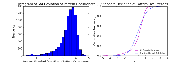
Note that the histogram is skewed left, whereas most of our other skewed distributions are skewed right because of being crunched up against zero. While one can’t have a negative standard deviation, the mode of the distribution is far over to the right and leaves plenty of room for a normal tail. Yet it is the tail on the right that is shortened. The distribution appears to be a “reversed” Weibull distribution with with a high value for the shape parameter. The CDF plot shows that for tight (small) and loose (large) spreads of two-note pattern occurrences, there are more in the database than in a normal distribution. For tunes where the spread of two-note patterns is quite average, there are fewer in the database than would be expected in a normal distribution.
20. Spread (Standard Deviation) of Two-Note Pattern Frequencies (Unweighted Occurrences)
The distribution of two-note pattern frequencies when repeats of patterns are not counted is shown below.
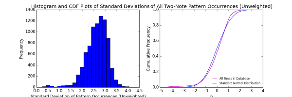
Unweighted two-note pattern frequencies have a similar distribution to weighted values (see previous metric), but are slightly less skewed. However, the distribution is still clearly not normal. But otherwise the comments on the previous metric apply to this one. It is not possible to determine from these plots whether it might be better to use weighted or unweighted two-note pattern frequencies in, for instance, discerning differences in musical genres or composers. The normality test for this metric confirms the eyeball test of non-nomality.
21. PIck-Up Durations
The duration of pick-up notes at the beginning of each tune is not a continuous data set, as shown by its histogram and distribution plots:

The histogram shows quite an erratic distribution with a mode of zero (no pick-up notes at the beginning of the tune). Such tunes start on the first downbeat of the first measure. The curious drop off in the second-from-the-left bar in the histogram corresponds to a duration value of 8, which is the length of a half note, and probably due to the fact that many tunes are written in 2/4 time. Tunes written with just two beats in each measure cannot have a pick-up note of duration 8, so the frequency of tunes with, say, a pick-up of two quarter notes is low. The lack of any recognizable distribution for this metric throws doubt on its usefulness to explain much. The CDF plot and normality test confirm the discreteness of the data and the lack of normality, respectively.
22. Pick-Up Duration Percent
The distribution of the pick-up note duration as a percent of the duration of the first measure is more orderly than that of the raw pick-up duration in the previous metric, as shown in the following figure:
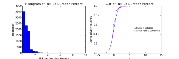
The histogram is highly skewed to the right with a severe drop off in the middle of the distribution. The shape of the histogram suggests a Pareto, Gamma, or a Chi-squared distribution. The CDF plot shows a surprising similarity to a normal distribution for the middle of the distribution. The distribution is bunched up toward zero because of the many tunes without pick-up notes at all. Neither distribution indicates normality, a fact confirmed by the normality test.
23. Duration Ratios of Patterns Going to Rests
When a played note is followed by a rest, it creates a two-note pattern consisting of a note(s) and a rest(s). All such patterns are stored such that their distribution can be viewed. The distribution of patterns where the second “note” is a rest is shown here:
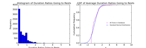
The histogram shows an erratic decline in the frequency of ever-lengthening duration ratios with a spike around unity (where the duration of the rest is equal to the duration of the preceding note). This distribution is dictated by the fact that one cannot have a negative duration ratio, which is bounded on the left by zero. As a result, the frequencies are bunched up just after zero. The CDF plot confirms the non-normality of the distribution, as does the normality test.
24. Duration Ratios of Patterns Coming from Rests
The distribution of two-note patterns where the second “note” consist of a rest or rests looks nothing like the previous metric:
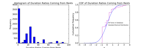
First, there is a much wider range of duration ratios in patterns coming from rest(s) compared to those going to rest(s). Second, the histogram is more sparse. Third, the distribution is not continuously decreasing, but rather jumps around. The mode is close to zero, which means that for the most part patterns coming from rests either are unity (the duration ratio is one) or the rest is quite short relative to the duration of the note preceding it. The discrepancy between this metric and the preceding one is something we will have to examine to understand better. For now, the difference in duration ratios of patterns going to rests and patterns coming from rests is simply puzzling, and we have no ready explanation at the moment why there are so many instances where the rest(s) durations are so much longer than the preceding note.
25. Number of Different Pitches
The histogram of the number of different pitches that make up each tune is bimodal with the spikes occurring on either side of 10 different pitches.
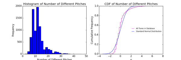
It is not immediately obvious why the histogram should be bimodal or why there would be so many fewer tunes written with 10 different MIDI pitches than with 9 or 11. The histogram is skewed right. There are fewer tunes with a small number of different pitches than would be expected in a normal distribution, and there are more than would be expected in the middle range. There fewer tunes having a large number of different pitches than in a normal distribution. The CDF plot and normality test confirm that last of normality in this distribution.
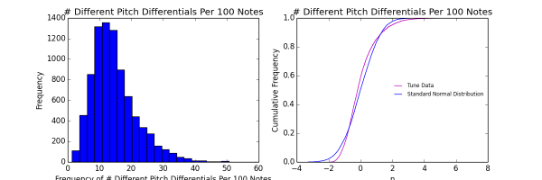
26. Number of Different Pitch Differentials
This metric’s distribution is more normally distributed than that of the raw number of pitches in the previous metric, but still far from truly normal:
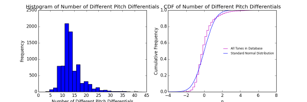
The distribution is still skewed right, but has only one mode. The CDF plot is similar to the CDF plot of the previous metric. The normality test shows slightly more normal results than for the previous metric (see the table at the top of this page), but confirms the lack of normality.
27. Number of Different Durations
The distribution of the number of different durations has a high concentration of tunes with four or five different duration lengths. It’s impossible to have less than one duration, so the distribution is skewed right:
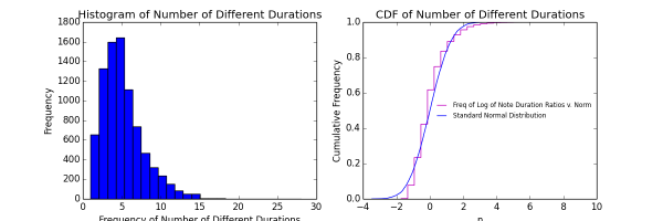
Because of the lower limit of one duration, there are fewer tunes in the database at the lower range than there would be in a normal distribution. There are more tunes in the database in the middle range than in a normal distribution, and fewer again in the upper range. The latter observation results from the fact that there is only one tune with 28 different durations in the database, and the next largest is a tune with 23 different durations, so the tail is sparse compared to a normal distribution. The normality test confirms the lack of a normal distribution.
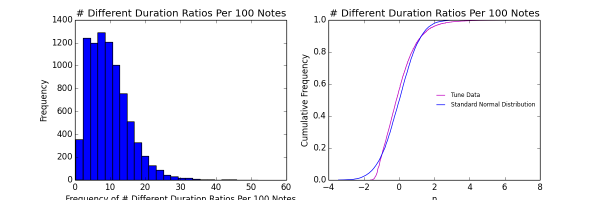
28. Number of Different Duration Ratios
The distribution of the number of different duration ratios is similar to the number of different durations themselves in that both are skewed right and both are bunched up near the lower limit of “one” (because there must be at least one duration ratio). But this distribution for duration ratios has a longer tail (see figure):
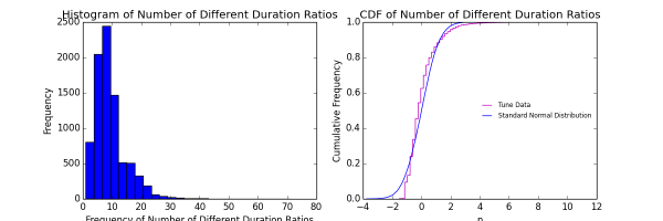
The comments that apply to the previous metric also apply to this one. The same tune that causes the long tail in the previous metric causes the even longer tail here with 71 different duration ratios in it. The normality test confirms that this distribution is not normally distributed.
29. Number of Different Pitches Per Note
The distribution for this metric, which normalizes metric for the number of different pitches in a tune, makes the distribution continuous, as shown in the following figure:
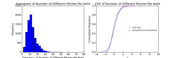
Compare this figure with Figure 26, the distribution for the number of different pitches. The bimodal nature of the histogram of FIgure 26 is transformed into a single modal figure in Figure 30. Both distributions are skewed right, however. The CDF plot shows a continuous distribution. Compared to a normal distribution, there are fewer tunes where the left tail would be (because we can’t have negative numbers in this metric), more tunes in the middle portion, and fewer again in the right tail where there are a lot of pitches per note. The normality test confirms the lack of a normal distribution for this metric.
31. Number of Different Pitch Differentials Per Note
Again, normalizing by the number of notes per tune has the effect of making the distribution of this metric continuous and more normal looking:
The histogram is skewed right, of course, because of the limiting factor of zero, and also rather peaky. As is the case with many normalized distributions in this database, there are fewer pitch differentials in the lower range, more in the middle range (which is consistent with the “peaky” look of the histogram), and fewer again in the upper range (see the CDF plot). Most tunes have between 10 and 16 different pitch differentials per hundred notes. The normality test confirms that this distribution is not normally distributed.
31. Number of Different Durations Per 100 Notes
The distribution of the number of different durations in a tune, when normalized per 100 notes, is similar to the non-normalized metric shown in Figure 28. The primary difference is that the normalized metric is a continuous distribution, as illustrated in the following figure:

The CDF plot follows the now familiar pattern of deviation from the normal distribution: There are fewer tunes with a small number of different durations at the lower range (left side of the CDF plot), more in the middle, and fewer again in the upper range. The normality test confirms the eyeball test that this metric is not normally distributed. Interestingly, the normality test suggests that this normalized metric is even further from being normally distributed than the non-normalized metric (see metric 27 above).
32. Number of Different Duration Ratios Per 100 Notes
This metric is the normalized version of the number of different duration ratios (see metric #28). As with other normalized distributions, the one for the number of different duration ratios per 100 notes is continuous, although the histogram is bunched up in the middle:
The distribution is heavily skewed right with the bulk of the frequencies concentrated in the range of 3 to 12 different duration ratios per 100 notes. We continue the usual pattern of having fewer tunes with low numbers of different duration ratios than a normal distribution would have, more tunes in the range of different duration ratios, and fewer again in the upper range (see the CDF plot). The normality test confirms the lack of a normal distribution for the number of different duration ratios per 100 notes.
33. Percent of Tunes with the Same Individual Patterns
This metric captures a similar dynamic as that of the Use of Common Patterns (#9 above), but is admittedly harder to understand. This metric consists of the percentage of tunes containing each and every pattern of the tune being examined. The number itself doesn’t mean much when calculated for the entire database, but the underlying distribution must be studied before we can apply it to distinguish genres, eras, or individual composers. The distribution for the percent of tunes with the same individual patterns is as follows:
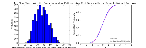
Unlike most of the previous metrics, this one does not seemed crunched toward one side or the other and therefore does not appear skewed. The CDF confirms the lack of obvious skewness (the two curves overlap in the center and the extremes are more or less symmetrical), but it also illustrates a complicated distribution. Note that at the lower range (for tunes with relatively small numbers of patterns that are also used in other tunes), there are fewer in the database than would be expected in a normal distribution. But there are more such tunes in the mid-low range and fewer again in the mid-upper range. At the high range, the two curves seem to converge. There are too many crisscrossing of the curves to suggest normality, but it’s close. The normality test confirms the lack of a normal distribution, but with a relatively close score.