Music Metric Correlations with Each Other
The music metrics are sometimes correlated with each other and the degree of correlation matters when examining the differences between musical genres, or between an individual tune and a music genre. Figure 1 below shows those correlations in a manner called a “heatmap,” so named because the colors are matched to a continuous scale, in this case the correlations between all possible pairings of music metrics. Each music metric is listed on the horizontal axis, and then again on the vertical axis. By looking at the color of the square at the intersection of any two different metrics, we can determine how much they are correlated with each other. Figure 1 was created with 82,000 tunes in the database, but it has not changed noticeably from when the database had about 40 thousand lines of melodies. It appears quite stable.
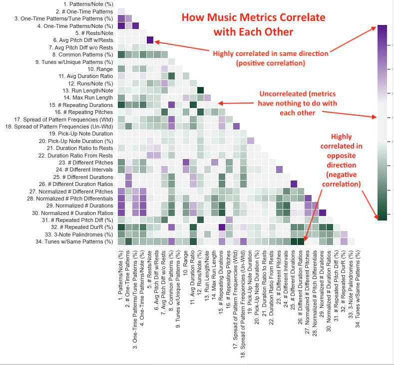
Pairs of metrics with a dark purple square are positively correlated (when one metric is high, the other metric tends to be high), while pairs of metrics with a dark green square are negatively correlated (when one metric is high, the other metric tends to be low). Squares that are almost white indicate pairs of metrics that are uncorrelated, which just means that knowing how one of the metrics moves doesn’t tell you anything about the other metric. The darker the purple or green, the higher the positive or negative correlation, respectively. The scale is drawn to reflect the statistical convention that correlations between -0.4 and +0.4 are considered uncorrelated (their ‘whiteness’ is emphasized, though some tinting is visible).
Let’s examine a couple of examples to make the figure clearer. On the vertical axis, look for the metric “Avg Pitch Diff w/Rests,” six metrics down starting from the top of the vertical axis. This metric measures interval leaps including the effect of rests. Follow to the right of that metric until you see the dark purple square, and then follow down from there to see that the other part of this pair of metrics is “# Rests/Note.” The dark purple color indicates these two metrics are highly correlated. That is, songs that have large intervals tend to have more rests per note, which makes perfect sense when you remember that this metric includes a zero MIDI value for rests, and that makes for large intervals. The more rests there are, the more large interval jumps there are.
Our remaining two examples cover uncorrelated metrics and negatively correlated metrics. Find “# Repeating Durations” in the vertical list about halfway down and follow over to where the red arrow is pointing. Moving down the column from the red arrowhead reveals that the corresponding metric is “Max Run Length.” The almost-white color of the square with the red arrowhead in it indicates that these two metrics are uncorrelated with each other. Knowing the value of one of them doesn’t allow you to know whether the other is similar or quite different. Indeed, it is difficult to imagine a reason the number of repeating durations would have anything to do with the length the longest run in a tune.
Finally, look at the last item in the vertical list of metrics, “Tunes w/Same Patterns (%),” and follow over to the red arrowhead, which is above the metric, “# Different Duration Ratios.” These two metrics are negatively correlated. When one is trending up, the other is trending down, and vice versa.