Histogram or Map of All Two-Note Patterns
This page contains maps of all two-note patterns found in the Skiptune database. A two-note pattern is any successive two notes where one or more may be tied to other notes. Such a pattern is fully described by an interval change and a duration ratio. Here, we plot intervals versus duration ratios to create the histograms. The categories along the horizontal axis are the intervals and the duration ratios are what we are counting in each category along the vertical axis.
This maps below reflect the 4,651 two-note patterns in the database when it had 82,000 unique melodies in January 2026.
Summary
1. Composers have only used a fraction of all possible two-note patterns. The vast majority of the unused patterns have a combination of both large intervals and large duration ratios, and those are rarely chosen by composers. The maps on this page show which of all the possible two-note patterns have been used so far.
2. Unique two-note patterns tend to occupy the periphery of the pattern maps (patterns with both large intervals and large duration ratios).
3. Highly common two-note patterns generally have both small intervals (no more than a perfect fifth in either direction) and small duration ratios under a value of 5.
Pattern Map
When we simply plot the intervals against the duration ratios, we get the following histogram, or map, of the patterns in the database.

The intervals (pitch changes expressed as MIDI values) are plotted on the horizontal axis and the duration ratios are plotted on the vertical axis. Each red dot represents an individual two-note pattern that some composer somewhere has used at least once in a melody. Most, of course, have been used multiple times, but frequency is not represented on this map. The lack of a red dot for a particular two-note pattern (the white areas in the above map) means that we have not found that pattern in any tune yet. The red dots at the far left and far right represent patterns involving rests. The right set of red dots represents patterns where the first note is a rest and the second note is a played note. The left set represents patterns where the first note is a played note and the second note is a rest.
If composers had used all possible two-note patterns, Figure 1 would be completely red. In fact, only a small portion of the map contains red dots, indicating that there are a lot of patterns that could be used by future composers. However, the pattern map makes clear that composers tend to write melodies in a small subset of all possible patterns, and this may be because note patterns in the rest of the area do not sound musical. Of course, what sounds “musical” to our ears changes over time, and the evidence for that is that we are slowly adding new intervals (red dots) each year.
To date, composers tend to prefer staying within an octave (up or down) and prefer using duration ratios less than 12–that is, the length of the second note is no more than 12 times the length of the previous note, such as quarter note followed by a half note. This finding is consistent with our intuition and observation that most melodies don’t jump more than an octave at a time, and most don’t have very short notes followed by very long notes (or vice versa).
Another observation from the map is that the larger the duration ratio (a short note followed by a very long note), the more likely the composer will stay close to a short interval jump. One can see this in the red dots that appear toward the top of the map: they tend to grow closer to unison (the center of the map horizontally) as the duration ratio approaches 80. This tendency by composers is why the histogram looks “peaky.”
Finally, we make two related observations: First, there is no duration ratio for which all possible intervals have been used by composers. We know this by noting that none of the red dots form a complete horizontal line anywhere on the map. The closest we come is for the smaller duration ratios toward the bottom of the map, but even here there are several gaps toward the left and right extremes. Second, observe that there is no interval for which all possible duration ratios have been used by composers. We know this by noting that none of the red dots come anywhere close to forming a complete vertical line for any interval.
As we continue to add tunes, of course, the map will fill in somewhat more, but we do not expect the overall shape of the map to change drastically.
Highlighting Unique Patterns
Having plotted our pattern map, we now want to know what it would look like if we highlighted those patterns that were unique–that is, occurring only once in the database. Figure 2 shows the result:
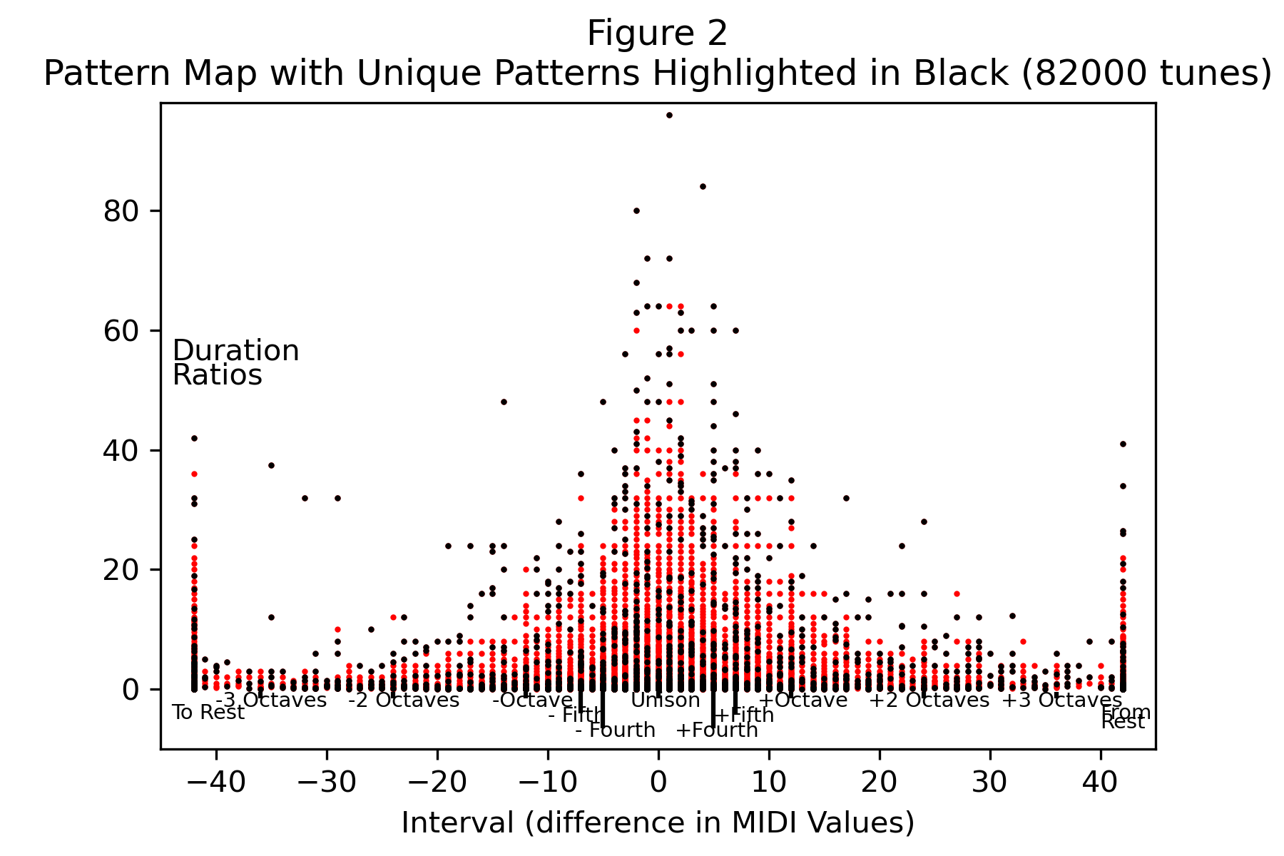
Figure 2 is the same as Figure 1, but highlights the unique patterns (the ones that occur only one time in the whole database) by representing them as black dots. We don’t see an obvious patterning except that most unique patterns are either those with a duration ratio close to zero (the bottom edge of Figure 2) or have large duration ratios (the upper half of Figure 2 and toward the center). That observation is consistent with the common sense point that composers tend not to use patterns where there is a large jump in either pitches or duration ratios, especially patterns that have large intervals and large duration ratios.
Highlighting Common Patterns
Next we examine the other end of the spectrum: highly common patterns. Figure 3 plots the same data as the previous two graphs, but highlights the most common patterns in blue. Here, we somewhat arbitrarily define “common patterns” as those occurring at least 1,000 times in the database. The plot results are not very sensitive to the definition of “common patterns,” and the results wouldn’t change much if we had used “at least 1,000” tunes or a varied the number a little from 1,000.
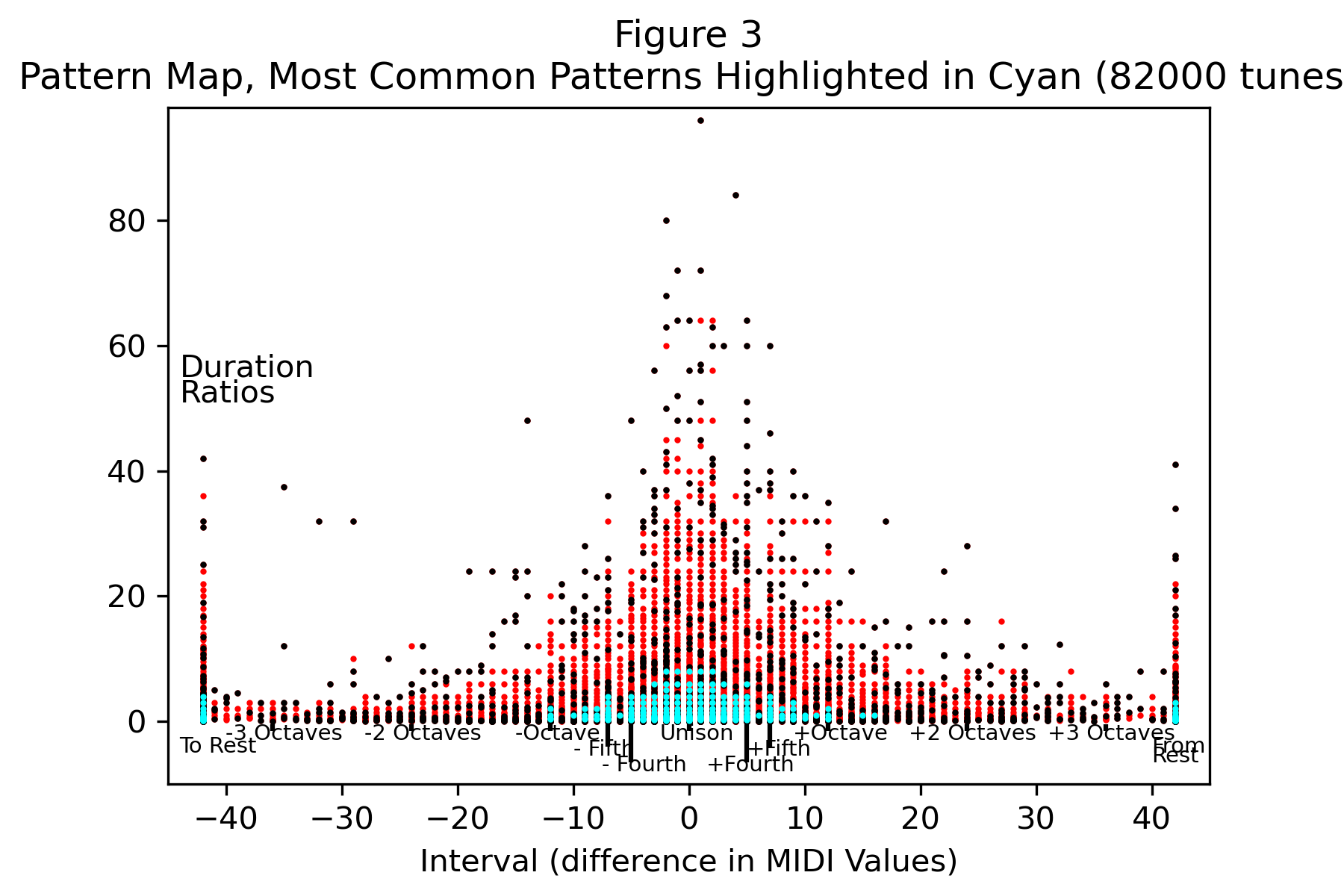
Figure 3 — Pattern Map with the Most Common Patterns Highlighted in Blue
As we can see from Figure 3, the most common patterns are those with low duration ratios, all of which are less than or equal to a value of six. Furthermore, most of the common patterns shown in blue are formed with intervals of a perfect fourth or less, either up or down in pitch. In other words, the most common patterns are formed with two successive notes where the second note is no more than six times as long (or as short) as the first note, and the interval is with a MIDI value of five or less. There are a handful of common patterns involving rests, all with duration ratios of 1.0 or less.
There’s one exception to the above observation. Turn your attention to the very bottom edge of the blue area and you will see some black dots, representing unique patterns. These are patterns with low duration ratios much less than one, but of course greater than zero. An example of such a pattern would be four tied dotted half notes followed by a sixteenth note, which would have a duration ratio of 1 / 80 = .021. This particular pattern shows up at the end of a Vivaldi largo (La Notte, Op. 10, RV 439), reproduced in Figure 4:

Paradox
The viewer may have noticed that the cyan-highlighted common patterns in Figure 3 are on top of the black-highlighted unique patterns in Figure 2. Unique patterns occur only once in the database, and they cannot be both unique and common at the same time. The explanation is that the graph’s resolution is such that points plotted very close to each other can appear one atop the other.
We will give one example of such a graphical overlap. The pattern of a dotted quarter note followed by a quarter note with an interval of a minor second (MIDI value of one) is represented in our notation as [1, 0.333] because the first number is the interval and the second number the duration ratio (a dotted quarter note has a duration of six). This is a common pattern. Now consider the pattern [1, 0.313], which can be formed from two tied whole notes followed by a half note tied to an eighth note. The duration ratio of that pattern is 10/32 or 0.313 when rounded to a decimal form. It appears at the end of La Fleur que Tu M’avais Jetee (Flower Song) from the end of Bizet’s Carmen Suite and appears no where else in our database. [1, 0.333] appears more than 1,000 times whereas [1, 0.313] appears only once. Both are plotted in the above maps and because they are so close to each other, they appear to overlap.
There is nothing to be done about this resolution issue except to view the above maps as a whole picture rather than focus too closely at any one pixel of the thousands forming the maps. Doing so allows us to draw broad conclusions only, which we’ve been careful to do on this page.